Logo
Branding
T-Shirt
We specialize in Brand Revamp. Its been more than a decade and a half and Apppl Combine has revamped more than a dozen serious and large brands. It came into the picture with the help of steel giant Jindal Stainless Limited. ARC, an initiative that led the Indian market in the domain of innovative solutions, adorned constructions, installations and structures with aesthetically designed stainless steel.
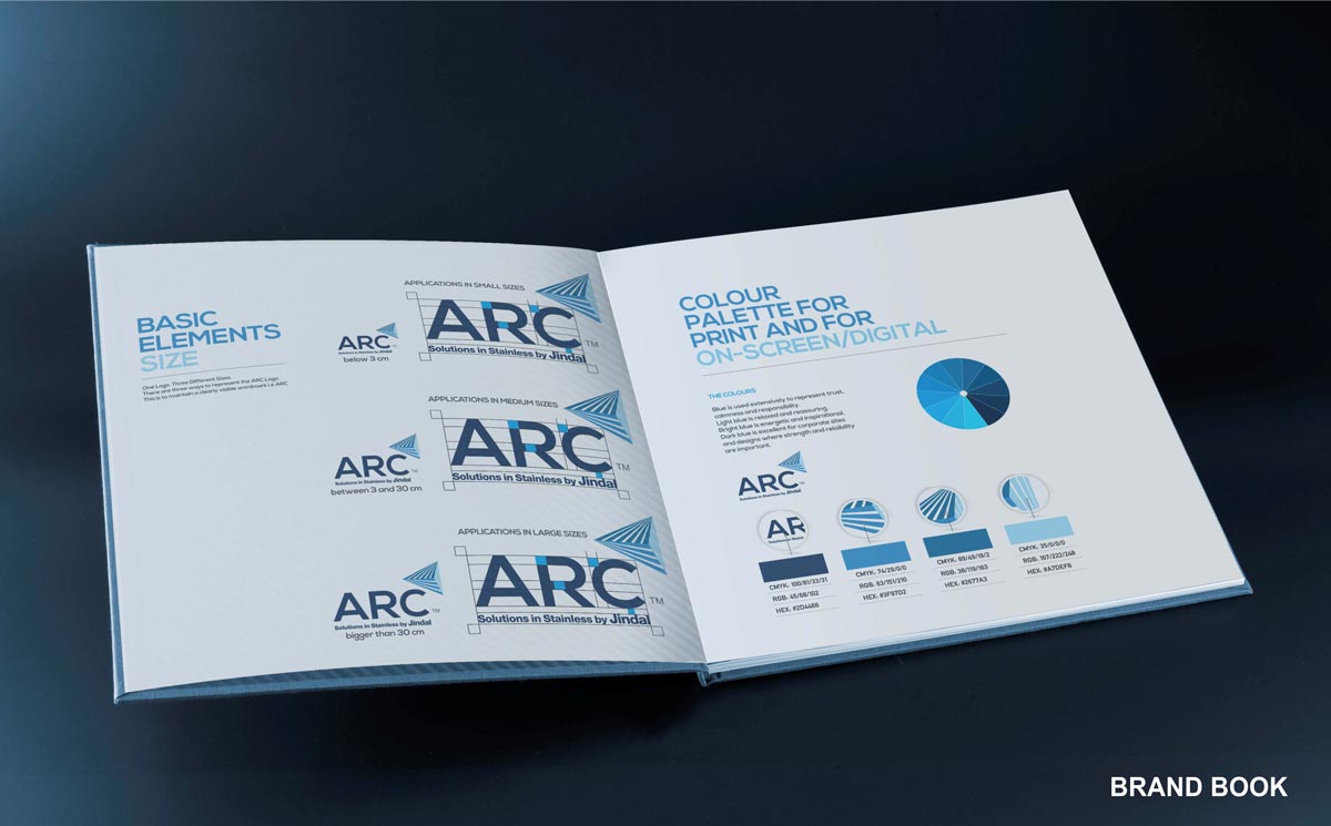
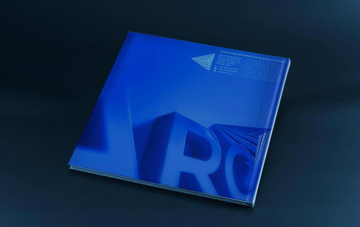
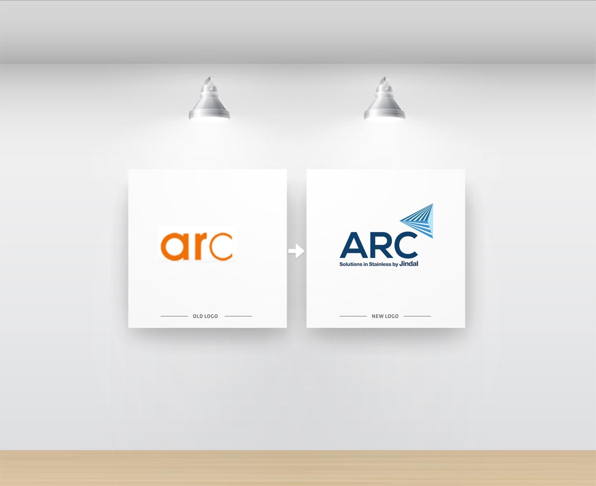
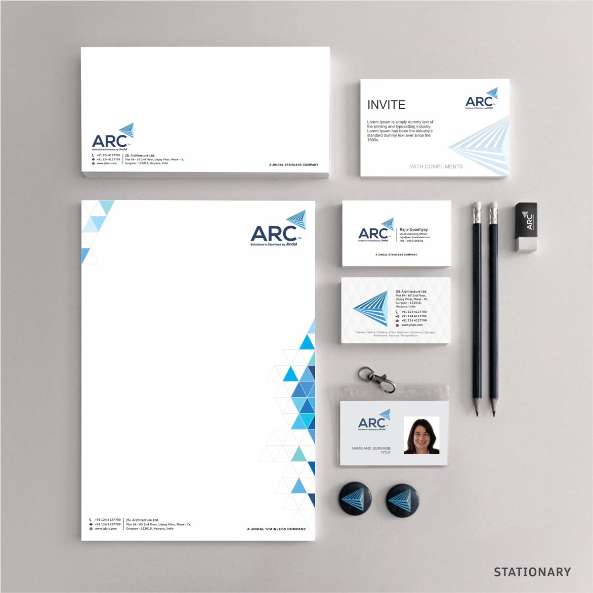
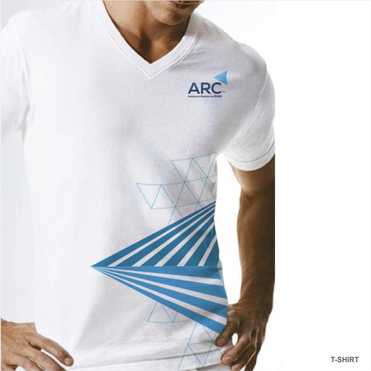
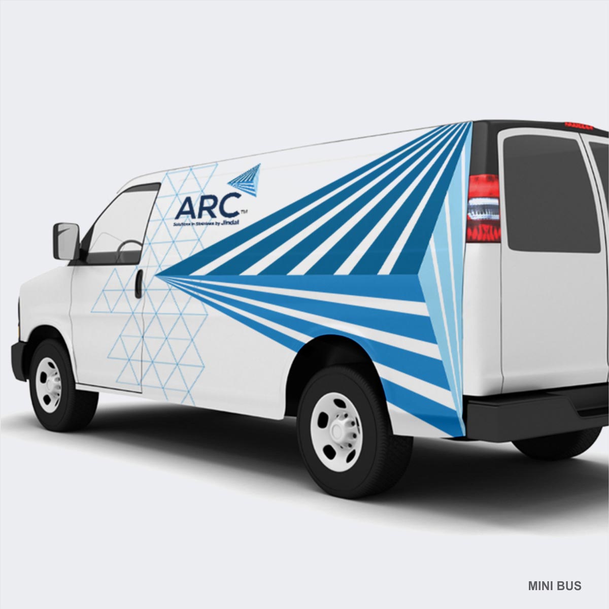
ARC has a great future in the unearthed Indian market. The goal then, was to get its personality in shape and claim leadership in this domain for the brand. The new revamped ARC's brand logo resonates innovative solutions, aesthetics, utility, durability, trust and its game-changing potential. The fonts we used for ARC reflect its high position in the market place. We selected an upper case font to suggest confidence and pride and dipped it in hues of blue to give it a certain kind of class. To portray the brand's unique personality we needed something equally brilliant in terms of image. Hence, we picked an image of path of rays travelling in various directions converging to form a prism. This image resonated with the core values of ARC. It depicted vividly, with charisma, the dynamism and success of the brand.
The prism that converges and diverges into spectacular colors has been positioned strategically at the right top corner of the ARC logo to show its elevation, its rise to power. The prism endowed the logo with grandeur. To emphasize the brand's goal of undisputed leadership in the market, we came up with a corresponding tagline. It not only provides for perceptional owning of the entire industry by ARC by claiming “Solutions in Stainless by Jindal” but also leaves no space for any company in future to claim bigger positioning. The tagline caught the attention we aimed to get.